Sketching
Graphite Pencils vs. Charcoal Sticks: Which Sketching Medium Fits Your Style?
Graphite Pencils vs. Charcoal Sticks: Which Sketching Medium Fits Your Style?
Graphite pencils and charcoal sticks sit in the same drawer, but they ask different things of your hand. One rewards a sharp point and a patient build-up of tone. The other responds to the flat side of a stick and a quick sweep of the arm. Neither is the better sketching medium. The useful question is which one suits the way you already like to draw, and which one will push your sketches somewhere new.
Control: Precision Versus Gesture
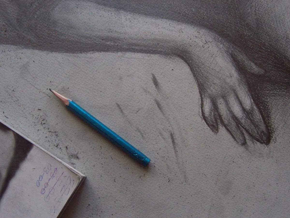
Graphite is the more controllable medium, especially when you keep a good point. A 2H or HB pencil lets you place a delicate contour, lift it with a plastic eraser, and redraw the same line without much damage to the paper. Softer grades such as 2B, 4B, and 6B give you darker marks and a wider range of pressure, but they still respond predictably. If you like drawing hands, architectural details, or small studies where the shape of a knuckle or the curve of a handle matters, graphite gives you a tight feedback loop: look, adjust, look again. A graphite study of a bicycle chain or a folded shirt collar can be built almost line by line, with each small correction visible and reversible.
What charcoal asks instead
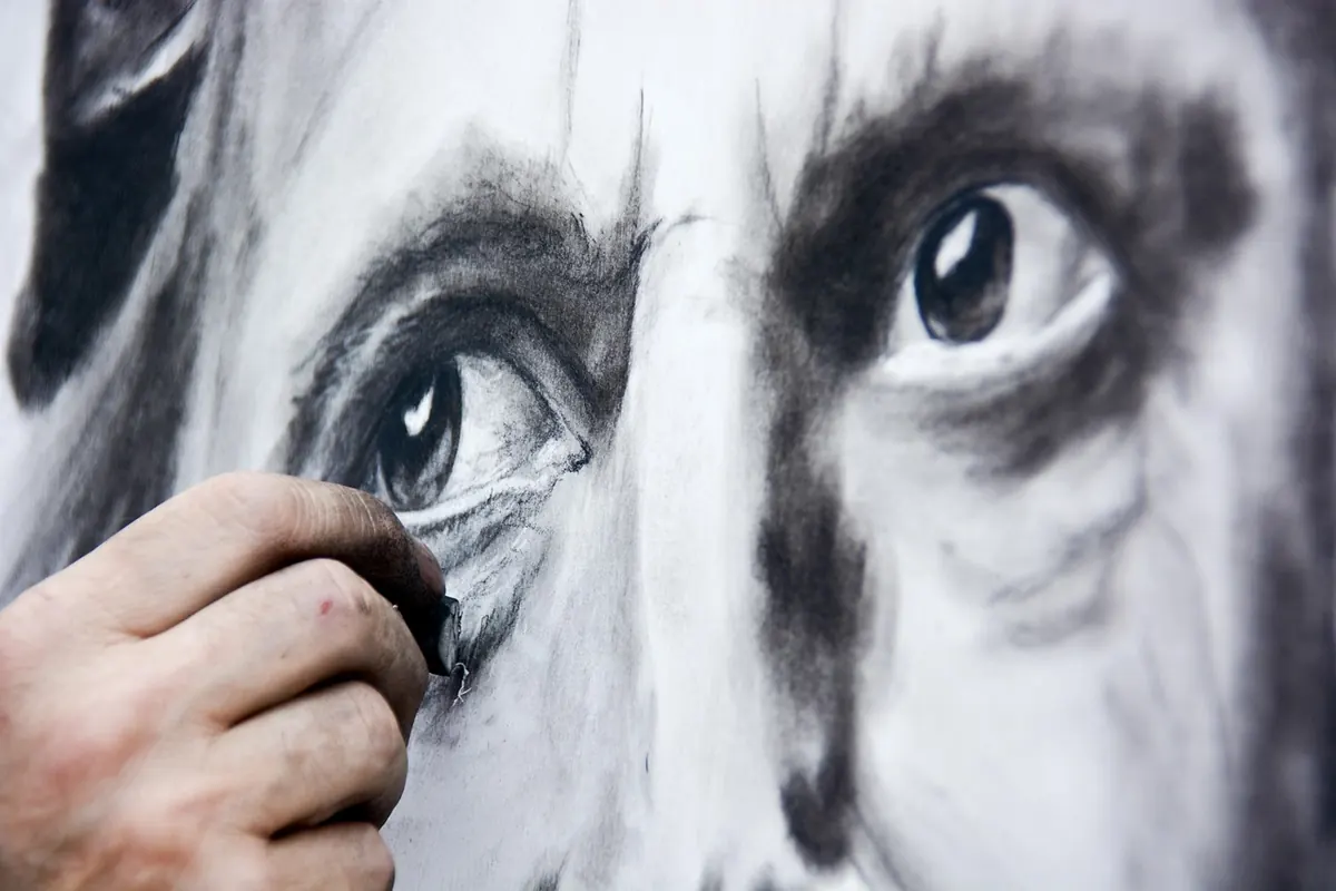
Charcoal is less interested in the single line. Vine charcoal is light and crumbly, good for blocking in a figure or a landscape and easy to wipe away. Compressed charcoal is darker and denser, and it holds a mark with more force. You can sharpen a charcoal pencil for detail, but a stick is happiest on its side, making broad strokes and soft edges. The trade is control for gesture. A charcoal sketch often looks decided, even when it was made quickly, because the marks are bold and the corrections are visible.
Contrast: Gray Range Versus Deep Black
Graphite can go from a pale silver-gray to a dark, slightly shiny gray. That range is beautiful for subtle modeling, especially in portraits and still lifes where you want to build value slowly. But graphite rarely gives you a true, matte black. If you press hard with a soft pencil, you get darkness, yet the surface may catch the light and reveal a graphite sheen.
Charcoal gives you a deeper black and a wider spread of soft middle tones. Compressed charcoal is the darkest of the common sticks; vine charcoal is lighter and more forgiving. This makes charcoal strong for shadow shapes, hair masses, and quick value studies. It also teaches a useful habit: decide the big dark shapes first, then refine. With graphite, the temptation is to fuss over small values before the drawing is ready for them. With charcoal, the big shapes are hard to ignore. A charcoal portrait can establish the shadow side of a face in one confident pass, while a graphite portrait may need several layered passes to reach a similar depth.
Smudging: Accident or Tool?
Both media smudge, but they do it differently. Graphite smudges when your hand drags across a soft grade, leaving a gray haze that can be erased but often leaves a stain. Charcoal smudges if you look at it too firmly. That sounds like a drawback, and sometimes it is. On a train, in a warm sketchbook, or over a finished drawing, charcoal dust travels.
The practical answer is to decide whether smudging is part of your language. For charcoal, a chamois, a paper stump, or a clean finger can turn a hard edge into a soft shadow. For graphite, a light touch and a scrap sheet under your drawing hand keep the page clean. Work from the top of the page downward, and rest your hand on a bridge of scrap paper rather than on the drawing. Right-handed artists usually work left to right and top to bottom; left-handed artists reverse the horizontal direction.
Keep a kneaded eraser nearby. It lifts charcoal and soft graphite without scrubbing the paper, and it can be shaped to a point for small highlights.
If you use spray fixative on charcoal, test it on a scrap first, because it can change the values slightly. Follow the label and work in a ventilated space.
Portability and Mess
Graphite wins the commute. A couple of pencils, a sharpener, and a vinyl eraser fit in a small case, and the sketchbook stays clean enough to close without worry. Graphite is also easier to use in a cafe, a waiting room, or any place where you do not want to leave a gray fingerprint on the table. A single 6B pencil and a pocket sketchbook are enough for a lunchtime study.
Charcoal is a studio and outdoor medium by temperament. Sticks break, dust settles, and compressed charcoal can be harder to erase completely. If you sketch outside, carry the sticks in a rigid tin, keep a rag or paper towel in the kit, and choose a sketchbook with paper sturdy enough to take the pressure. A large newsprint pad and a single stick of charcoal can be liberating, but they are not the setup you want in a white shirt. The mess is part of the speed: you can cover a page in a minute and still have a drawing with weight.
Paper, Erasers, and Other Practical Differences
Graphite is comfortable on smooth paper, but very rough paper eats the point and makes fine detail difficult. Medium-texture drawing paper is a good all-round choice. Charcoal needs tooth, meaning a surface with enough texture to grab the dust. Smooth paper lets charcoal slide and smudge into a gray fog; medium or rough paper holds the mark. Toned paper is especially useful with charcoal because you can add white chalk or a white charcoal pencil to lift the lights. If you plan to use both graphite and charcoal on the same page, test them together first: graphite can resist charcoal, and charcoal dust can muddy graphite lines.
Combining Graphite and Charcoal in One Drawing
You do not have to choose a side forever. Many sketchbooks hold both media on the same page, and the combination can be practical rather than fussy. Vine charcoal is excellent for blocking in a figure or a landscape because it wipes back easily. Once the big shapes are in place, a graphite pencil can add the sharp accents: the edge of a jaw, the line of a window frame, the veins on a leaf. On toned paper, a white charcoal pencil can finish the drawing with a few highlights.
Order matters. Work lightly with charcoal first, then add graphite where you need a more controlled line. Keep the charcoal away from areas that will receive fine graphite detail, or fix the charcoal lightly before switching. Some artists reverse the approach: graphite for the focal point and charcoal for the surrounding shadow mass. Either way, test the layering on scrap paper. The two media can look wonderful together, but they can also turn into a gray smear if you fight their different habits.
A Quick Way to Choose Your Medium
When you are packing a sketch bag or deciding what to use for a new study, ask yourself what the drawing needs most:
- Choose graphite if you want fine detail, clean corrections, and a drawing that can be closed in a sketchbook without much worry. It suits architectural studies, small portraits, product sketches, and careful value building.
- Choose charcoal if you want bold shapes, deep shadows, and a drawing that feels fast and physical. It suits figure studies, landscapes, moody portraits, and any subject where gesture matters more than a tidy line.
- Try both if you want a charcoal underdrawing with graphite accents, or a graphite study that gains a little shadow mass from a soft charcoal stick.
The most useful choice is the one that keeps you drawing. If graphite makes you patient and precise, use it. If charcoal makes you braver and quicker, use that. And if you are not sure, make the same sketch twice—once with a 2B pencil, once with a stick of vine charcoal—and compare what each medium noticed, simplified, and ignored.
Photo: epicantus / Pixabay