Drawing Tips
Common Shading Mistakes That Make Sketches Look Flat
A sketch can be accurate and still feel like a sticker pressed onto the page. The proportions are right, the lines are confident, and yet the object sits there as though it had been cut from colored paper. Most of the time the shading gives it away — not the pencil, not the paper, and not some mystery ingredient in the wrist. Flatness tends to come from a handful of repeated habits: a light with no direction, values that crowd each other, edges that are all equally sharp. Each of those is fixable in an afternoon of practice, and none of them requires new tools.
Here are the mistakes worth checking for, roughly in the order they tend to sneak into a drawing.
Light That Comes From Everywhere
Look at the last twenty pages of your sketchbook and ask a blunt question: from where is the light coming? In a lot of early work the honest answer is "all sides." There is a shadow under the chin and a shadow on the left arm and a shadow on the right arm, a highlight on each corner of a box, cast shadows falling in two or three directions at once. The eye cannot build a solid object out of that, so it reads the shading as texture instead of form.
Decide the direction before the first tone goes down. Draw a small arrow in the corner of the page and leave it there as a reminder. If you are working from life, pick one lamp or one window and stay put; walking around the subject mid-drawing is the fastest way to contradict yourself. Light coming from above and slightly to one side reveals volume far better than light aimed straight at the subject, which flattens everything the way a camera flash does.
Then check consistency in the cast shadows. An apple on a table has a shadow side and a cast shadow on the tabletop, and both must agree about where the light is. When they don't, the object looks pasted onto the surface rather than sitting on it.
Values Crowded Into a Gray Middle
This is the most common reason a drawing looks dull rather than flat, and it is easy to spot from across the room. Every tone sits in the same narrow middle range: nothing light enough to feel lit, nothing dark enough to feel shadowed. Form depends on contrast between two families of value — the light family and the shadow family — and if those families merge, the drawing turns to gray mush.
The squint test
Squint at the sketch, or step back three paces. If the whole thing collapses into one undifferentiated gray mass, the values are not grouped. A quick fix is to plan them before shading: sketch a small thumbnail using only the white of the paper for the lit side and one mid-dark tone for the shadow side. Once that reads clearly at the size of a stamp, you have permission to start the real drawing.
Give yourself a small, fixed set of values — three or four is plenty for a sketch — and make them noticeably different from each other. Half-steps are what create mud. Reserve your darkest dark for two or three small accents, usually where forms meet or where a shadow is trapped, and let the lightest light stay as bare paper.
Shading the Outline Instead of the Form
Watch a pencil move on an unfamiliar shape and you will often see it follow the contour, laying tone in a band that hugs the edge like a border. The result looks like a cutout with a thick outline drawn around it. Real form does not work that way: tone changes as planes turn away from the light, and the darkest area usually sits inside the silhouette, not along it.
Take a mug lit from the left. The left edge stays light, the core shadow falls somewhere inside the shape toward the right, and then a strip of reflected light lifts the far edge slightly before it meets the background. Shade that strip as dark as the outline and the mug flattens instantly. Keep the tone where the turning happens and let the edge itself stay relatively light.
Ask what each patch of tone is describing
Every area of shading should answer a question: which plane is turning away from the light here? If you cannot say, lift the pencil and look again. Marks made out of habit rather than observation are the ones that turn a drawing to mud.
Every Edge the Same Sharpness
Edge control is the quiet skill that separates a sketch that feels solid from one that feels printed. A sphere has a soft transition into shadow. The cast shadow of a cup is crisp where it touches the table and loses focus as it travels outward. A fold of fabric can have a razor edge on one side and a gentle gradient on the other. When all edges are equally sharp, the drawing looks like a coloring book page; when all are equally soft, it looks foggy.
Decide edge quality before you blend anything. Use the side of the pencil for soft transitions, a sharpened point for crisp ones, and deliberately lose a few edges where the form turns into shadow or merges with the background. Lost edges give the eye somewhere to rest, and rest is what makes a drawing feel three-dimensional.
Blending as a Rescue Mission
Smudging will not fix a shape that is wrong; it will only make the wrongness smoother. Blending averages values, so a muddled set of tones becomes a very even gray blob with no structure inside it. It also tends to spread softness everywhere, which flattens the edges you worked to differentiate.
Before you reach for a stump or a fingertip, hold the drawing at arm's length and check whether it reads with the pencil marks still visible. If the form is not there in two values, more blending will not find it. When you do blend, do it selectively — soften the terminator on a rounded form, keep the cast shadow edge firm, leave some pencil texture in the mid-tones so the surface stays alive.
Reflected Light Treated as a Second Sun
Reflected light is real and worth drawing, but it is bounce, not a second light source. It should stay clearly weaker than anything on the lit side, and it should never be brighter than the mid-tone you established there. Overdo it and the shadows read as holes or as shiny patches on a matte surface. The darkest note in a form usually sits at the terminator or in the occlusion where two forms press together, not along the outer edge. Keep that hierarchy and the object will feel anchored rather than levitating.
A Checklist to Run Before You Put the Pencil Down
- Can I point to the light source, and does every cast shadow agree with it?
- Squinting, do the lights and darks read as two families or one gray middle?
- Is the darkest dark inside the form rather than tracing the outline?
- Comparing my sharpest edge to my softest, is there a real range between them?
- Is every reflected light still darker than the lit side's mid-tone?
- Stepping back, does the object read for ten seconds without explanation?
Do not try to fix all six at once; you will freeze up. Pick one item per sketch and let it be the thing you watch for. Spend a week on light direction, then a week on value grouping, then a week on edges, and the change will show up in the drawings without you having to think about it. Sketchbooks are for repetition, not performance, and a page of small studies with one clear light and three honest values will teach you more than a large, carefully blended drawing that was never quite sure where the sun was.
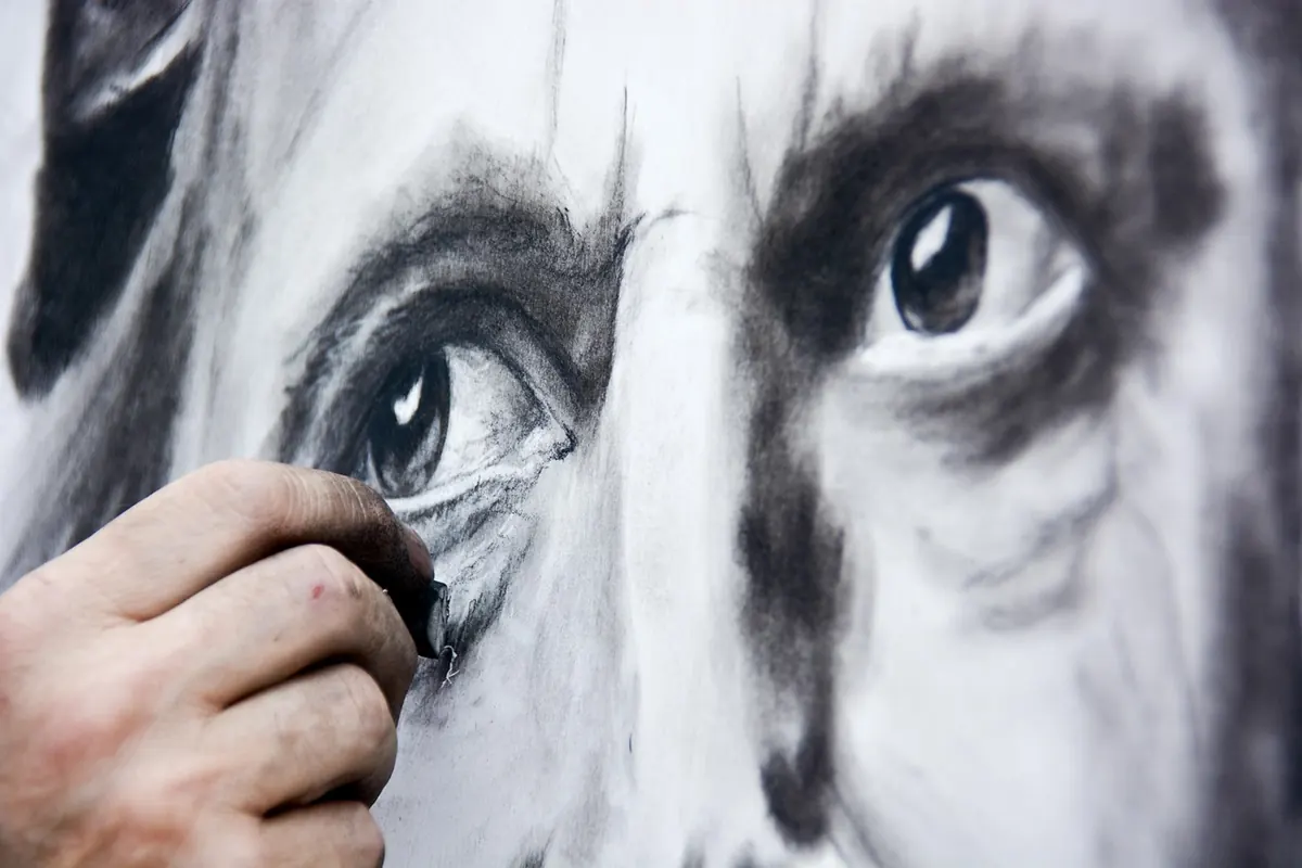
Photo: Rudimaes / Pixabay