Sketchbooks
Sketchbook Paper Showdown: Smooth vs. Textured Pages
Most sketchbook regrets start with paper. You buy a handsome book, crack it open, and somewhere around page twelve you notice the pencil is skating, or the fineliner is catching, or a pale wash has turned the sheet into a relief map. The paper isn't bad. It's simply working against the tool you reached for.
Surface is the quietest variable in a sketchbook and the one that shapes your drawings most. Here is how smooth and textured papers actually behave with pencil, ink, and light washes — and how to test a page before you commit a whole book to it.
What Paper Texture Actually Is
Paper is a mat of fibers — cotton, wood pulp, or a blend — and the surface you touch is a small landscape of peaks and valleys. Artists call that tooth. Manufacturers borrow language from watercolor: hot press for smooth (pressed between heated rollers), cold press for medium texture, rough for the heaviest. Sketchbook labels use the terms loosely. A "smooth" book may still have a faint grain, and a "vellum" surface usually means lightly textured rather than perfectly flat.
Two properties matter as much as texture. The first is weight, given in grams per square meter. A 90 gsm page is thin and shows what's on the other side; 120 to 160 gsm is the everyday range for drawing books; 200 gsm and up shrugs off more moisture. The second is sizing, a starch or synthetic coating that controls absorbency. Heavy sizing keeps ink and watercolor sitting near the surface, which gives crisp edges and less bleed. Light sizing lets liquid sink into the fibers, which gives soft edges and more feathering.
Smooth Paper: Precision Without Distraction
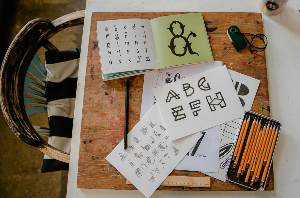
For fine detail, smooth is hard to beat. Cross-hatching at one-millimeter spacing, a 0.05 fineliner, the small geometry of a windowsill or a pair of glasses — on a smooth sheet the lines land exactly where you put them. Nothing interrupts the stroke, so the drawing reads as intention rather than accident.
Graphite behaves differently here too. It sits on top of the surface instead of catching in valleys, which makes soft pencils blend into silky gradients with a fingertip or a tortillon. Alcohol markers lay down evenly, without the patchiness that texture creates. Erasing is cleaner.
The trade-offs are real. Because the graphite never quite grips, a 4B or 6B pushed hard will turn shiny and slightly greasy. Every eraser pass and fingerprint shows. Work an area with a hard pencil five or six times and you can burnish the paper into a slick patch that refuses to take more tone. Smooth paper rewards a light hand and punishes overworking, which is either a discipline or an annoyance depending on your temperament.
Textured Paper: Grip and Grain
Tooth does two useful things. It grabs pigment, and it interrupts lines.
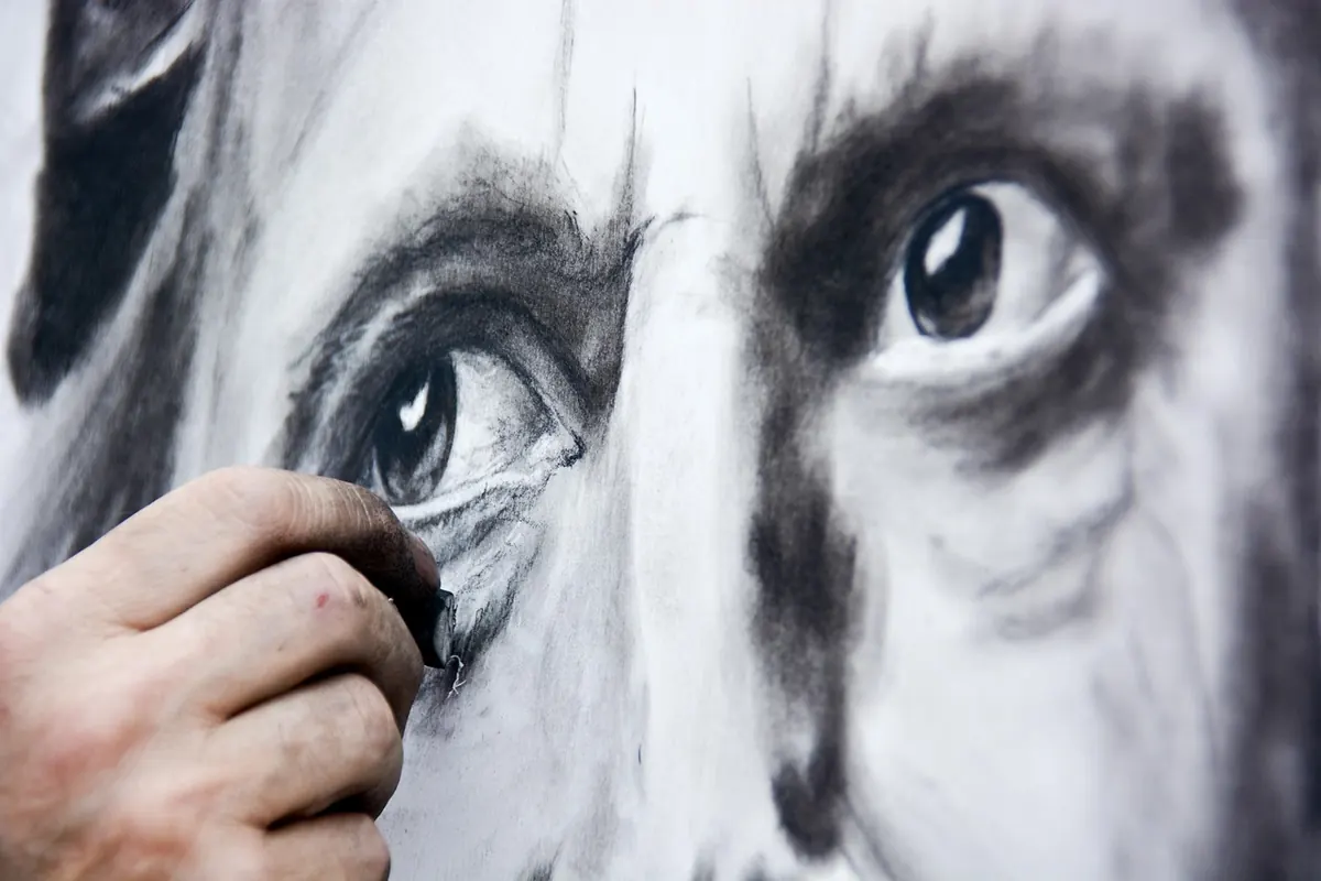
Grabbing is a gift with dry media. A 2B on a cold-press sheet catches the peaks and skips the valleys, so even a light stroke arrives with grain in it. Tone builds fast and forgivingly, layers stay matte instead of going shiny, and charcoal, pastel, and colored pencil finally feel like they have something to hold on to. If you like smudging with your thumb and lifting highlights with a kneaded eraser, texture gives you something to work with.
Interrupting is a matter of taste. A 0.05 fineliner dragged across a rough sheet bumps and skips, breaking up like a bad radio signal. Dip nibs can snag stray fibers and spit a blot of ink. Drawing a small face on heavy texture is like drawing through a screen door. Some sketchers lean into it deliberately for a dry, scratchy, reportage look. Others find it maddening, and that's fair.
Ink: Where Smooth Paper Earns Its Keep
If your sketchbook is mostly ink, smooth paper usually wins. Technical line work, architectural studies, comics panels, and dense hatching all depend on a consistent line weight, and a flat surface delivers it. Brush pens also respond well, since the tip glides rather than stutters.
Watch for two problems that have nothing to do with texture. Feathering happens when wet ink wicks along the fibers and leaves a fuzzy edge; it's a sizing issue, and it varies wildly between brands. Bleed-through happens when ink or marker soaks to the reverse of the page; it's a weight issue. Keep a spare sheet of blotter paper behind the page you're working on, especially with alcohol markers, and test any new pen in the back of the book before you commit a drawing to the front.
A quick check: draw a line, wait ten seconds, then drag a fingertip across it. If the ink smears, the paper is heavily sized and the ink is sitting on top rather than soaking in. That's fine for most work, but it means a wet wash later will lift the line.
Light Washes: Sizing Matters More Than Texture
Why the coating decides the outcome
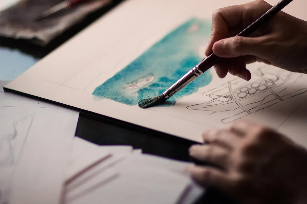
For a pale wash of one or two passes, sizing is the deciding factor. On a heavily sized smooth sheet, water pools where you put it and dries with a hard-edged tide line. On a lightly sized textured sheet, it sinks in and spreads softly through the valleys, sometimes beautifully, sometimes blotchily. Neither is wrong. Know which one you're buying.
What weight and texture do to a wash
Weight controls buckling. A 120 gsm page will cockle under a wet brush, and a 160 gsm page will cockle less. You can tape the edges down, work drier, or accept the wave as part of the book's character. Texture controls granulation and edge quality: pigment settles into the hollows and leaves the peaks pale, which reads as atmosphere on a landscape and as noise on a portrait.
Test the layering, too. Graphite can smudge and lift under a wet brush, and water-soluble inks will run. A small wash strip over pencil and over ink tells you more in thirty seconds than any product description will.
Five Tests to Run on a Single Page
Before you fill a book, spend one page in the back learning what it can do.
- The pencil ladder. Draw short strokes with an H, a 2B, and a 6B, light then heavy. Look for skipping, shine, and how quickly the tone darkens.
- The hatch grid. Fill three small squares with cross-hatching at different densities. Crisp lines mean smooth; broken lines mean tooth.
- The pen line. With your everyday pen, draw one slow line, one fast line, and a tight scribble. Check for skipping, feathering, and show-through on the reverse.
- The wash strip. Brush a pale wash across plain paper, over pencil, and over ink. Watch for cockling, tide lines, and smearing.
- The eraser test. Erase hard in one spot twice. If the surface fuzzes or pills, keep your erasing gentle and your layers few.
Choosing Without Overthinking It
Match the book to the medium you reach for most, not the one you aspire to. If your pages are mostly pencil and ink with an occasional pale wash, a smooth or lightly grained 160 gsm book is the safe default. If you draw with charcoal, soft graphite, colored pencil, or dry brush, buy texture and let it work for you.
Many sketchers keep two books going: a smooth one for line and detail, a textured one for tone and mess. That's not indecision, it's just honest tooling. When you start a new book, write the date, the paper type, and the medium on the inside cover. A year from now, that note will tell you more about what suits your hand than any review.
Photo: Maddy Freddie / Pexels